Studies ::
BRANDING
LOGO / LOGOTYPE
The logo and logotype design for Aera are a modern and minimal expression of a new level of style and performance in skate footwear. Power on a new Aera!
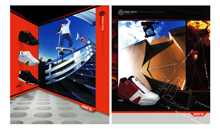
ADVERTISING
DISTINCT PERSPECTIVES
We combine brand elements with exagerated perspective elements to create the look of Aera’s advertising. These full page ads ran in Skate Boarding and other top magazines in the skateboarding industry.
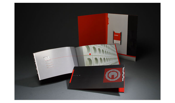
COLLATERAL
CATALOG + PRESS KIT
An excellent visual expression of what the Aera brand represents and it’s position as a top tier brand in the world of skateboarding.
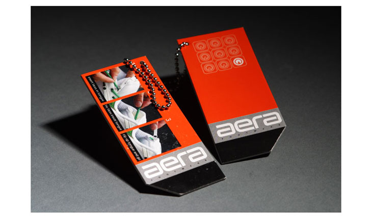
COLLATERAL
HANG TAG
The design of the hang tag utilizes the established tab element and brand identifiers. It also illustrates Aera’s proprietary in-tongue lacing system.
COLLATERAL
BLISTER PACKAGING
Powerline 6 designed the Aera blister package to draw attention to the unique style of Aera footwear when presented at industry tradeshows. The blister proved to be very effective. Buyers found it simply irresistable.
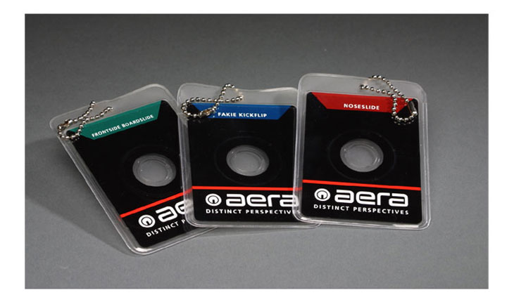
COLLATERAL
DIGICARD
Powerline 6 designed the Aera digicard as a tool to reach Aera’s consumer it the most direct way. The digicard accompanies the hangtag on every pair of Aera shoes and features a ‘How to’ video of our team riders performing and explaining various tricks.
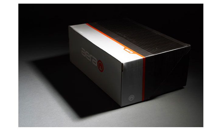
COLLATERAL
SHOE BOX
A solid clamshell construction to withstand the rigors of shipping and the retail environment. The color and graphic breaks create a dramatic presentation when multiple boxes are stacked at retail.
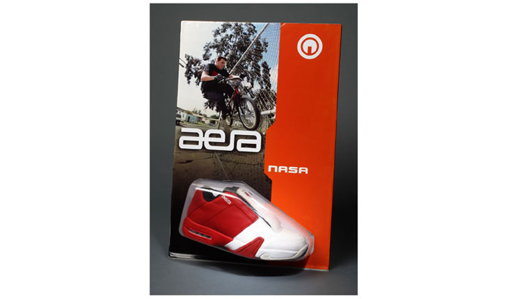
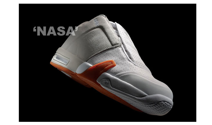
PRODUCT
NASA
As Aera’s flagship footwear product, the NASA was a deep exploration of style and function in performance skate shoes. We built the NASA with all the features necessary for a safe landing.
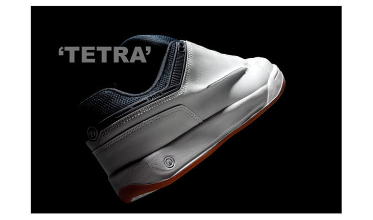
PRODUCT
TETRA
Classic silhouette and proportion. The Tetra integrates a breathable and structured cuff to enhance performance. The ‘pinch seam’ on the the side of the Tetra offers wear protection in a new way!
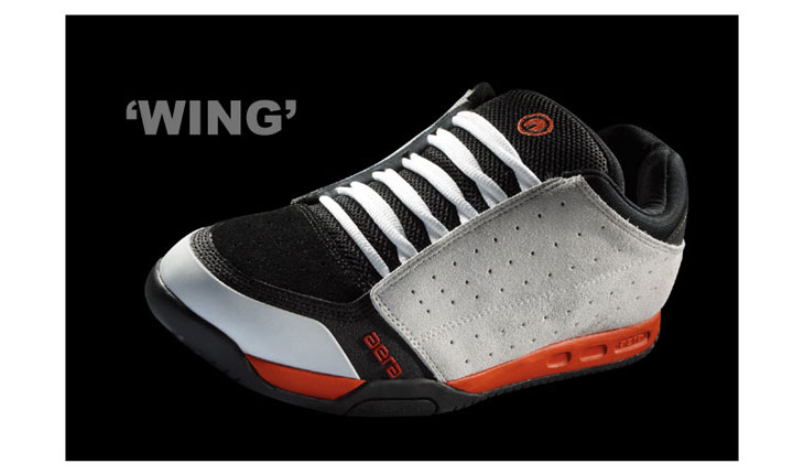
PRODUCT
WING
The Wing design works so well because every line and detail are intentional and seamlessly integrated. The Wing’s execution took into account every advanced material and manufactuing process available to create a high style, high performance skate shoe.